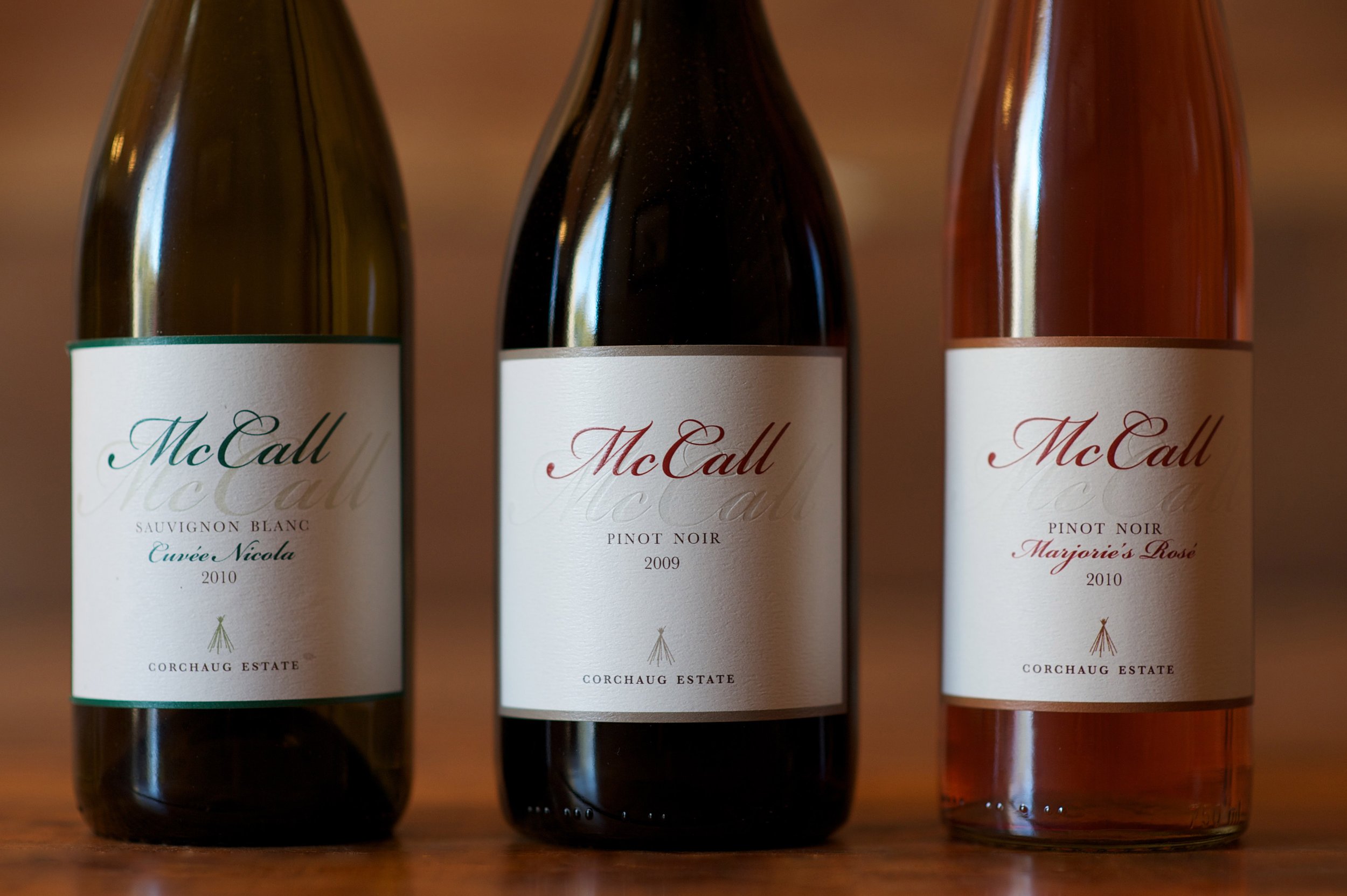
Branding design for a former wine distributor and family-owned, clay-rich vineyard.
The site of the original vineyard, established on land rescued from development, borders the Fort Corchaug archaeological site and Down’s Woods preserve. As with all of my designs, the person and place that will be using the design is the main focus. Russ McCall, the vineyard owner, is sophisticated, poised, and focused on land conservation. It was important to me that the use of his name on the brand labels exemplified these same qualities. The choice to use Bickham Script for the main focal point of the design was very intentional. Bickham Script is a classic, formal script typeface based on the lettering of 18th-century writing masters, as rendered in the unparalleled engravings of George Bickham.
The combination of the embossing represents the present—the deep red and raised text, and the debossing represents the past—family history to the land as a blind imprint.


